Some countries, like China, India, and the United States have very large populations while others such as Monaco, Malta and Bhutan have very small populations.
In general, it is the small island nations such as Tokelau, Tuvalu and Nauru that have the world's smallest populations. An interactive table of population sizes by country from 2008-2013 is available from the World Bank.
Not only do different countries have different sized populations but their populations also grow at different rates. A few countries (about 20) including Russia, Hungary, Japan and Greece are not growing any more but have zero or negative growth rates. The World Bank has produced a table of country growth rates from 1980 – 2013.
In the event any of these links become outdated you may visit The World Bank site at 'worldbank.org' and search for them.
National (country specific) populations are affected by a number of factors. Internal growth is affected both by having a higher number of births than deaths and also by having a higher number of immigrants than emigrants. At a national level there are three main drivers of population change, fertility, mortality and migration. Each of these is influenced by complex internal factors, including cultural and religious influences. In addition to these three factors, disease, war and natural disasters can affect national population size and age structure.
For example, the Black Death (plague) in Europe in the mid-1300s was estimated to result in between 75-200 million deaths, World War 1 and World War 2 accounted for about 17 million and over 60 million deaths respectively and the famine following China's Great Leap Forward in 1958-61 resulted in at least 18 million deaths.
We project future populations from current populations (Census data) by adding births, subtracting deaths and adjusting for migration. This involves making assumptions about fertility, mortality and migration rates.
END NATIONAL POPULATIONS EXPLANATION
In order to determine whether a population is growing or in decline we need to understand the structure of a population (how many old and young are in the population) and how this structure is changing over time.
Population pyramids are side-by-side histograms of the population grouped by age and sex, and are used for two purposes:
- To look at the age structure of the population
- To investigate changes in the age structure over time
You can create population pyramids using Microsoft Excel, a sample of which can be downloaded below.
Find out more about creating population pyramids at:
The link below provides time series of population growth and population pyramids for most countries in the world, from populationpyramid.net.
EXAMPLE
New Zealand
These population pyramids show how the structure of the New Zealand population has changed since the end of the Second World War, and how it is projected to change over the next thirty years.
Looking at population pyramids across time gives a graphical display of the demographic effect of momentum (either that of population growth resulting from a youthful age structure or that of population decline resulting from an older age structure) can be viewed. Jackson (2001) says these 'two trends are often on a seemingly unavoidable collision course'.
Dynamic population pyramids show this process in action, leading up to and beyond the point (different for each country) where natural increase (growth) shifts to become natural decrease (decline). They can also be used to look at 'what if' analyses of population projections.
The easiest way to do this is using a dynamic population pyramid that demonstrates the changes in the age structure across time. Many countries now provide these on the websites of their national statistics office, and some are available on the internet.
Dynamic population pyramids are also a useful tool for comparing the changing age profiles of different countries.
For example, the link below shows the changing age structures in China, Europe and the United States of America.
If the link is outdated go to 'china-profile.com' and look for 'Population by Age and Sex'.
EXAMPLES
Examples of dynamic population pyramids:
END POPULATION PYRAMIDS
As for the world population, within countries the total fertility rate is defined as the expected number of children a woman would bear through her child-bearing years.
Country specific total fertility rates are influenced by factors such as the country's age structure and life expectancy, individual's desired family size, access to and use of contraceptives, and cultural and religious attitudes to childbirth.
Most countries currently have declining total fertility rates.
EXAMPLE
New Zealand
The TFR in New Zealand declined in the late 1800s, but rose again after World War 2. It has since declined until reaching a plateau at about 1.96-1.98 (apart from a couple of baby 'blips' in 1991 and 2008).
Source: Statistics New Zealand
END FERTILITY
As with fertility, age specific mortality rates are also a factor. Each country uses data on mortality (deaths) to work out life expectancy.
EXAMPLE
New Zealand
The following two graphs give the changing crude death rate (per 1,000) and life expectancy at birth over time in New Zealand.
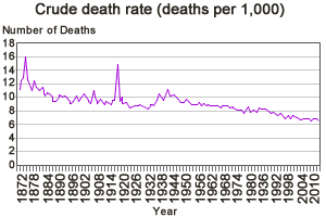
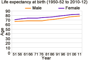
Source: Statistics New Zealand
Populations have natural increase when there are more births than deaths and natural decline when there are more elderly than children (more deaths than births).
EXAMPLE
New Zealand
The graph below shows the 'Natural Increase', the births minus the deaths, for New Zealand.
New Zealand: Natural Increase (births minus deaths)...
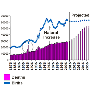
Source: Statistics New Zealand
END MORTALITY
Migration also influences population growth and some countries are trying to use immigration to change the age structure of their current population.
However, migration trends are often volatile as shown in the graph below for New Zealand and usually measure movements not people. The long-term impact on population growth is not always as expected and may differ across ethnic or national groups.
EXAMPLE
New Zealand
The graph below tells us the the net permanent/long term migration for New Zealand.
New Zealand Net Permanent/Long Term Migration
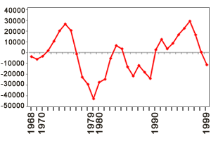
Source: Statistics New Zealand
Net Migration (in a given year) = Immigration - Emigration
The next graph shows the net outcome for different population groups in New Zealand.
PLT Migration: Net gain or loss by previous/next country of residence
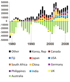
Source: Statistics New Zealand
Population Growth (Decline) = Fertility - Mortality + Migration
END MIGRATION