Introduction
Scatter graphs are used to display data where we have two numerical variables for each observation (e.g. person).
Use one dot, or plot symbol, for each observation but don't join the dots! We often, however, draw a single straight line (as in the example below) that 'best fits' the data if there is a trend (this can be done easily in Excel).
Example
Weekly Income ($) by Hours Worked (first 10 of 200 records)
| Sex | Age | Hours (weekly) | Income ($ per week) |
|---|---|---|---|
| F | 15 | 4 | 87 |
| F | 40 | 42 | 596 |
| M | 38 | 40 | 497 |
| F | 34 | 8 | 299 |
| F | 45 | 16 | 301 |
| M | 45 | 50 | 1614 |
| F | 36 | 12 | 201 |
| M | 35 | 45 | 934 |
| F | 38 | 26 | 624 |
| M | 37 | 50 | 533 |
A scatter graph of the data shown above looks like this:
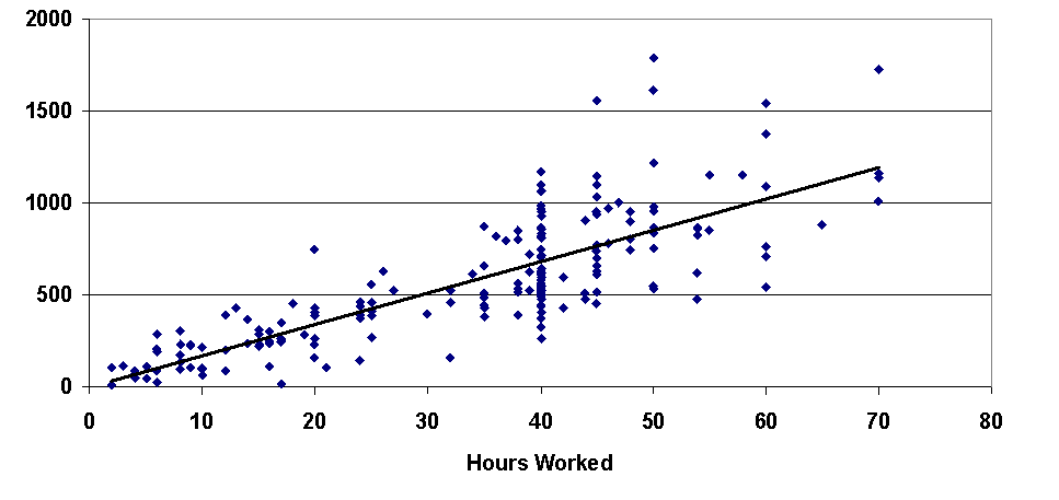
Excel gives the equation of the line fitted above as:
Weekly Income = 17.7 x Hours Worked + 0.35
and R2 = 0.63
Video
This video requires a browser capable of HTML5 or Flash video.
Documents
There are two files associated with this lesson:
- Instructions for this lesson (pdf)
- Data file (xls)