
Introduction
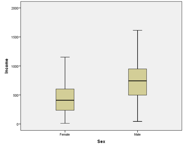
A Box plot is used for numerical data as an alternative to a histogram. It has a box showing the range from first to third quartiles, the interquartile range. The median divides this box into the second and third quartiles. The whiskers span the first quartile and the fourth quartile.
Box plots are often used to compare groups (e.g. sex or ethnicity).
Example
Income of a small sample of New Zealanders (first 10 of 200 records).
| Sex | Age | Hours (weekly) | Income ($ per week) |
|---|---|---|---|
| F | 15 | 4 | 87 |
| F | 40 | 42 | 596 |
| M | 38 | 40 | 497 |
| F | 34 | 8 | 299 |
| F | 45 | 16 | 301 |
| M | 45 | 50 | 1614 |
| F | 36 | 12 | 201 |
| M | 35 | 45 | 934 |
| F | 38 | 26 | 624 |
| M | 37 | 50 | 533 |
Box plots of the data shown above look like this:
Video
This video requires a browser capable of HTML5 or Flash video.
Documents
There are two files associated with this lesson:
- Instructions for this lesson (pdf)
- Data file (xls)