Introduction
Bar charts are used for (relative) frequencies in classes of categorical variables, or for discrete data. For example, numbers of people in different ethnic groups, or number of people with different numbers of siblings.
Key properties
- There are gaps between the bars (to emphasise that the data are discrete)
- The length of the bars represents (relative) frequency
The basic bar chart can be extended when we have more than one variable to display:
- e.g Counts of two categorical variables: clustered or stacked bar charts
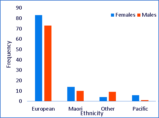
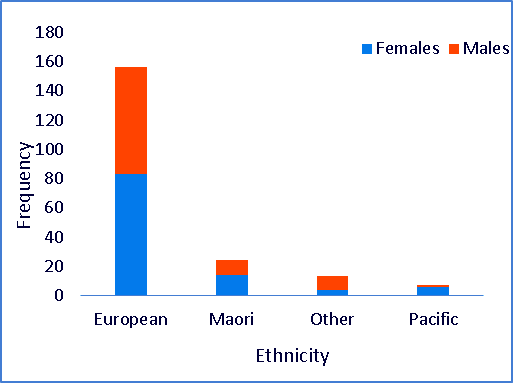
Example
Ethnicity and sex of a small sample of New Zealanders.
| Ethnicity | Females | Males | Total |
|---|---|---|---|
| European | 83 | 73 | 156 |
| Maori | 14 | 10 | 24 |
| Other | 4 | 9 | 13 |
| Pacific | 6 | 1 | 7 |
| Overall | 200 |
The data tabled above can be represented as bar charts:
Clustered bar chart
Stacked bar chart
Video 1
This video shows how to create a simple bar chart.
This video requires a browser capable of HTML5 or Flash video.
Video 2
Building on knowledge gained in the first video, this second video shows how to make clustered and stacked bar charts.
This video requires a web browser capable of HTML5 or Flash video.
Documents
There are two files associated with this lesson:
- Instructions for this lesson (pdf)
- Data file (xls)